rvivek
rvivek

"The Weed"
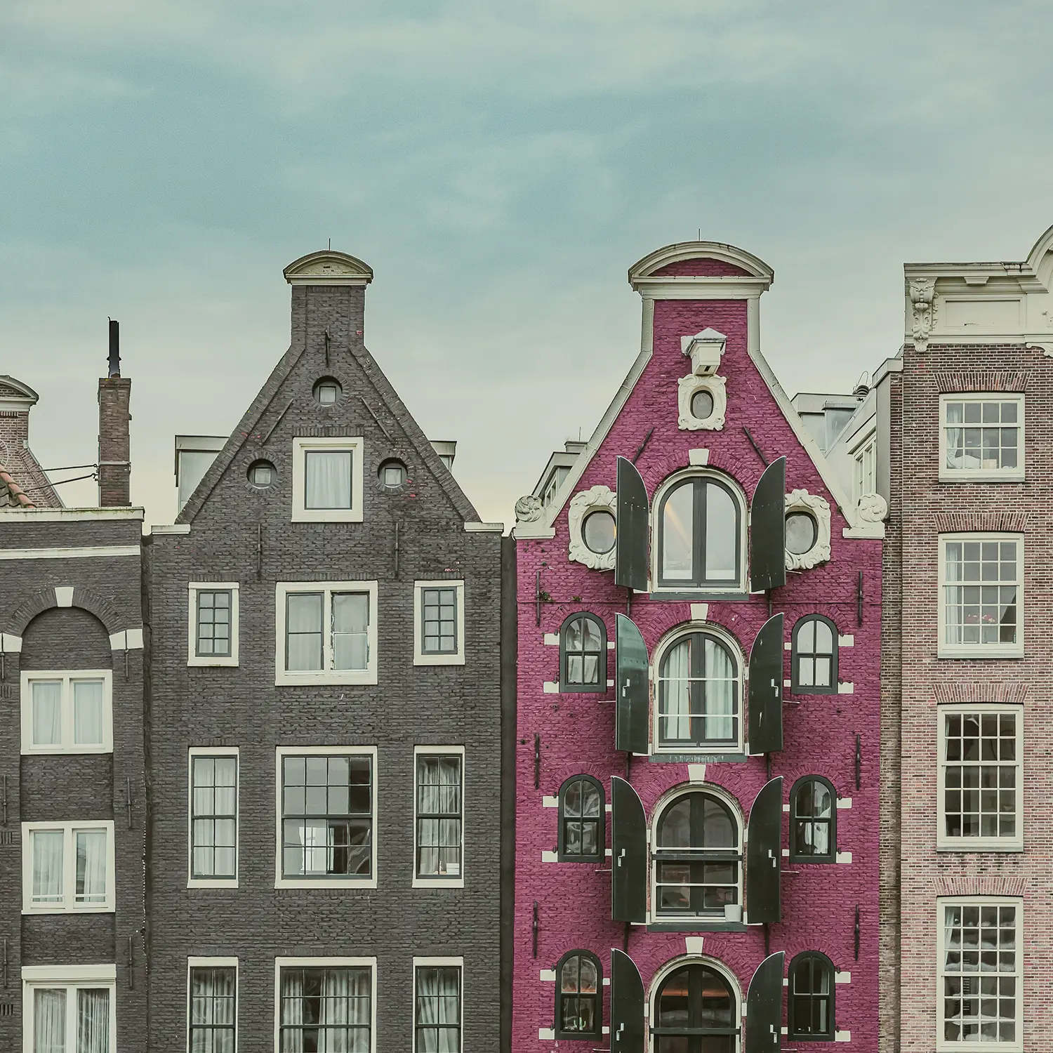
Amsterdam

Cannabis cafe
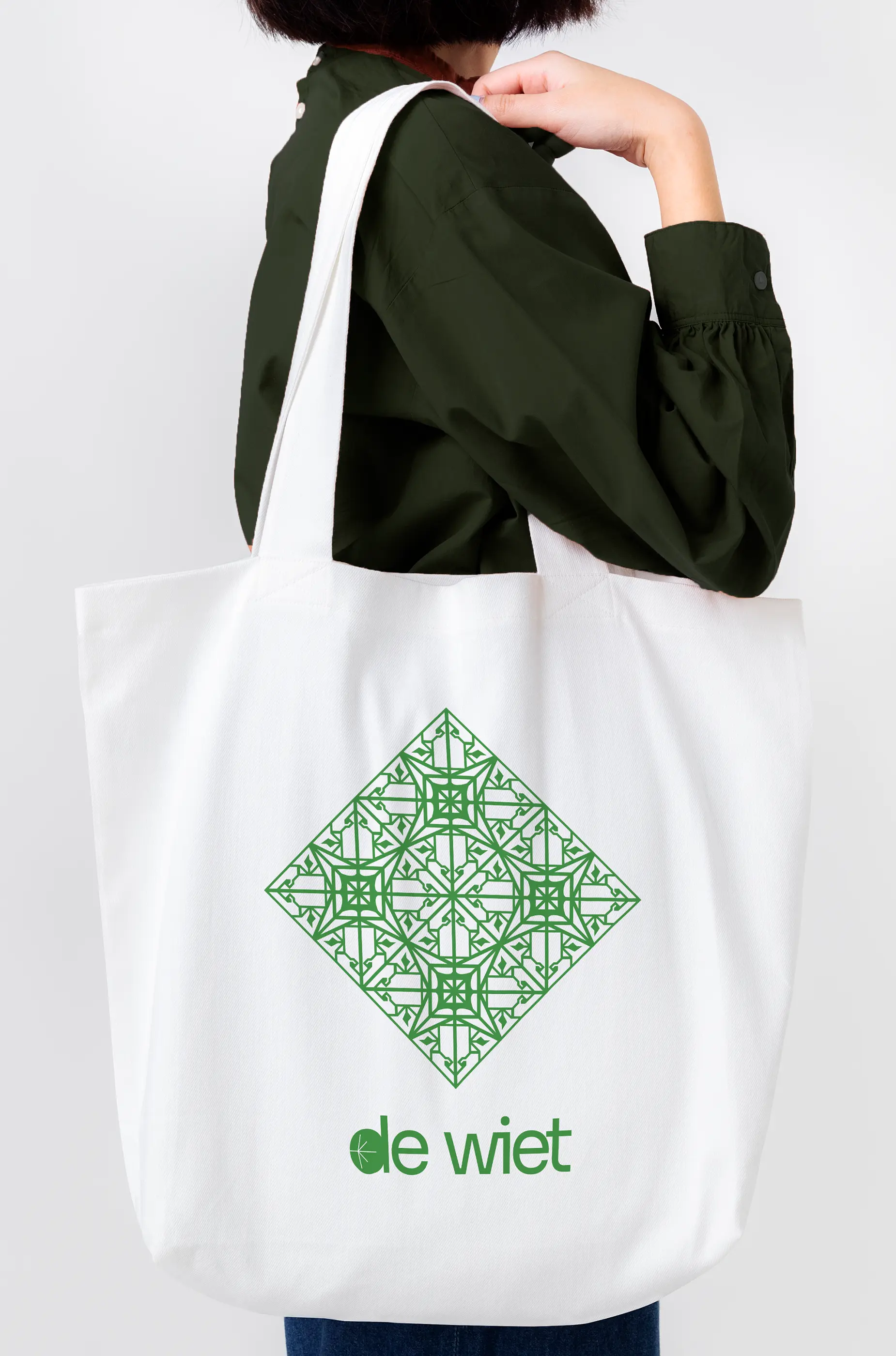
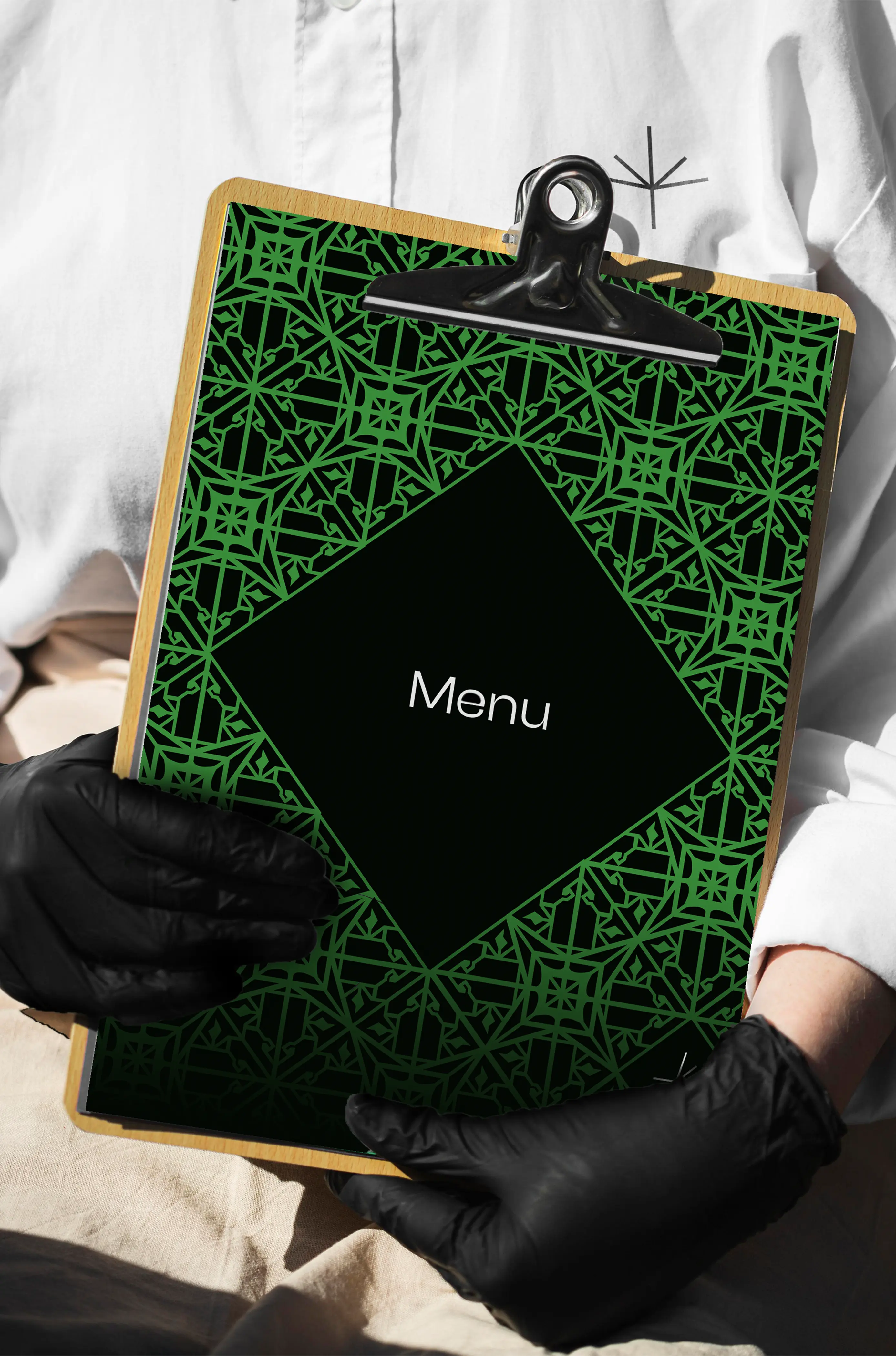
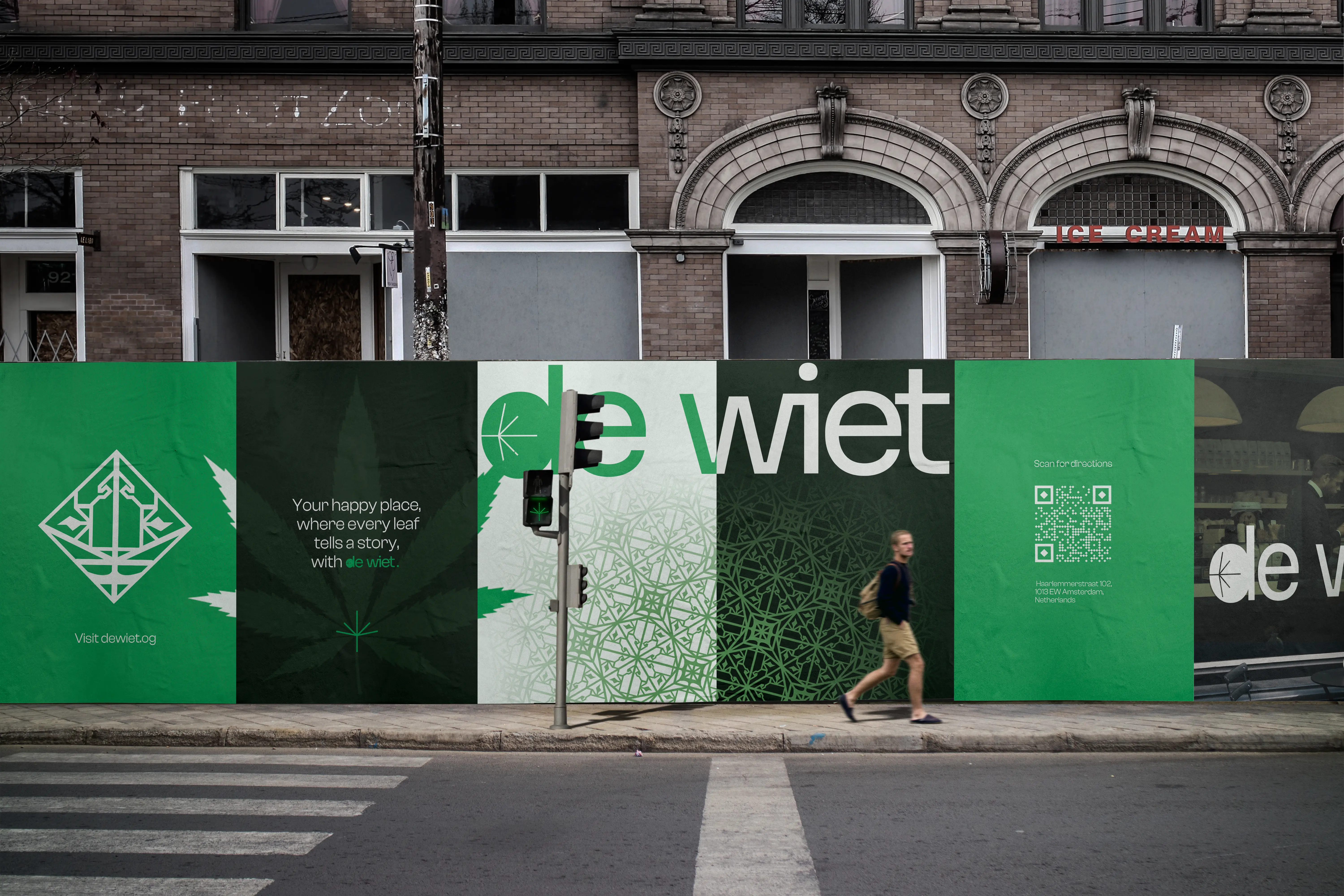
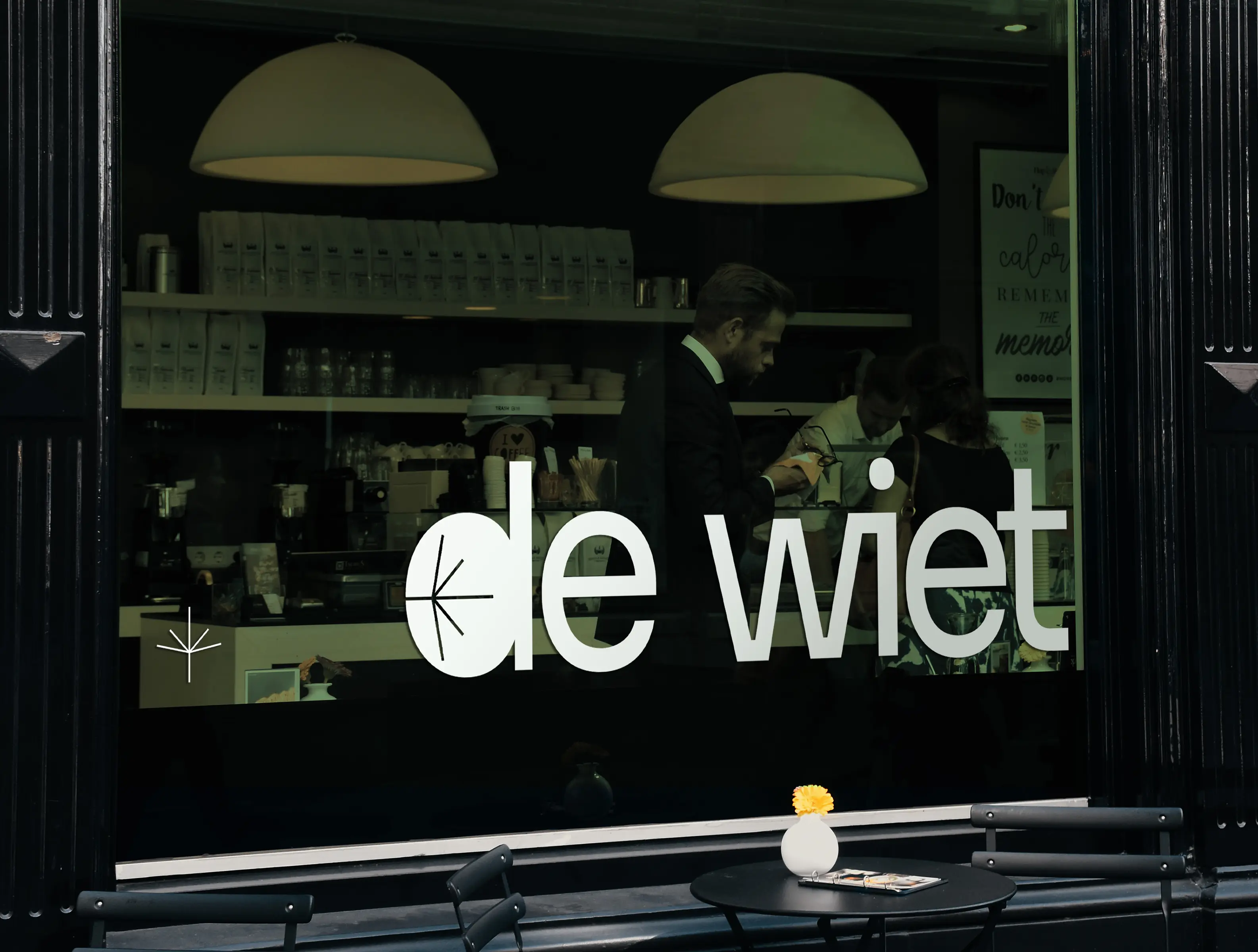
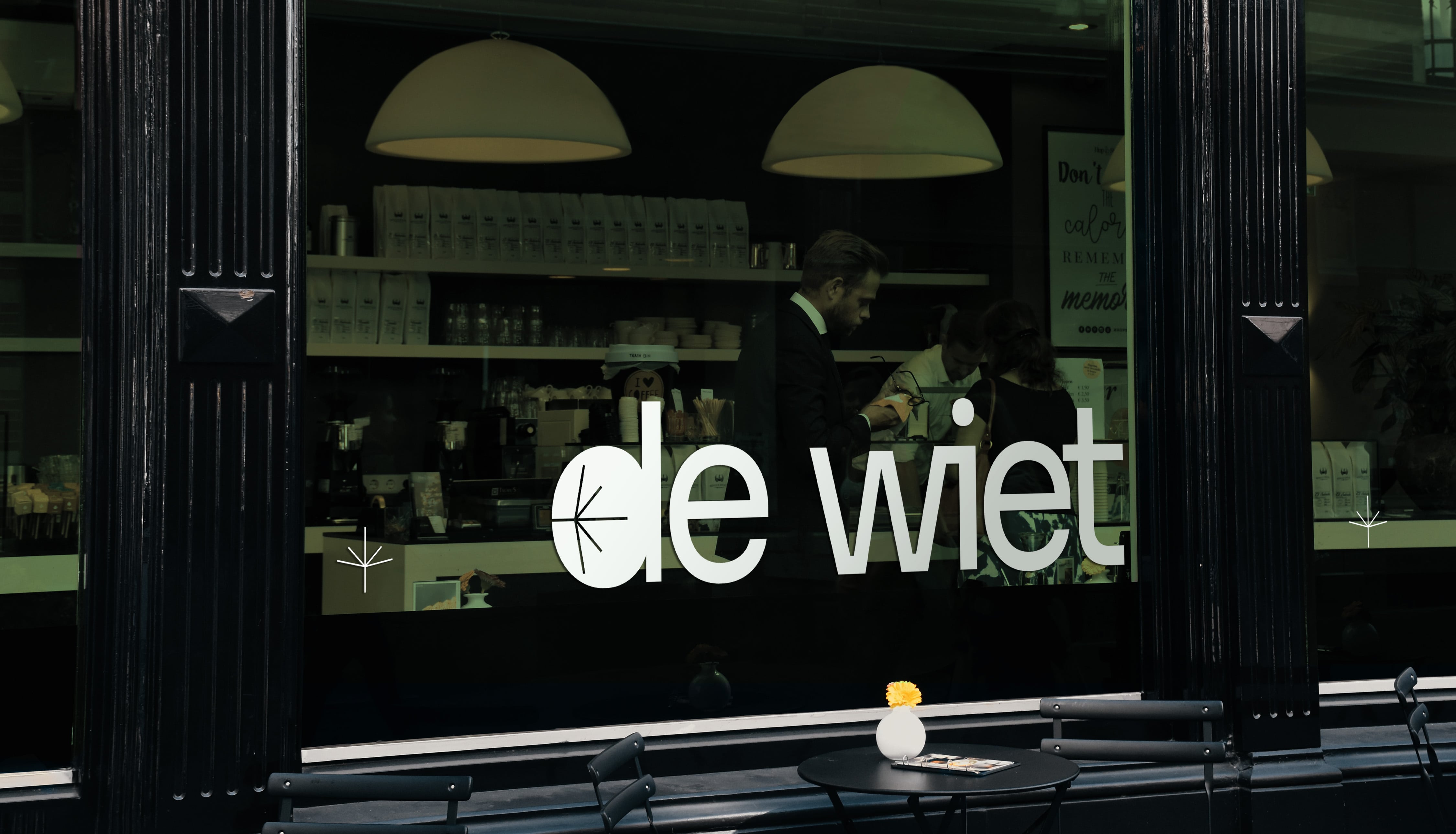
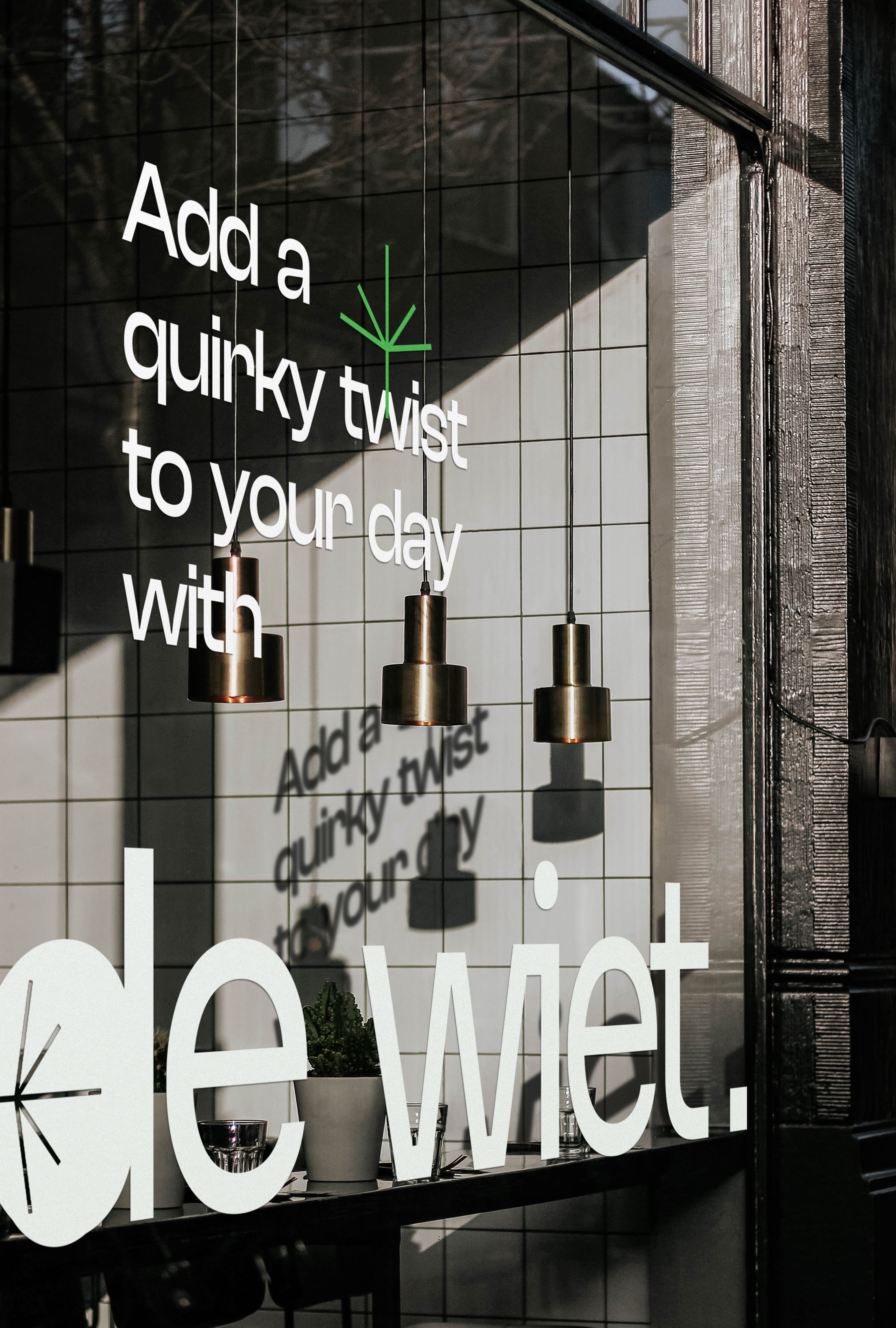
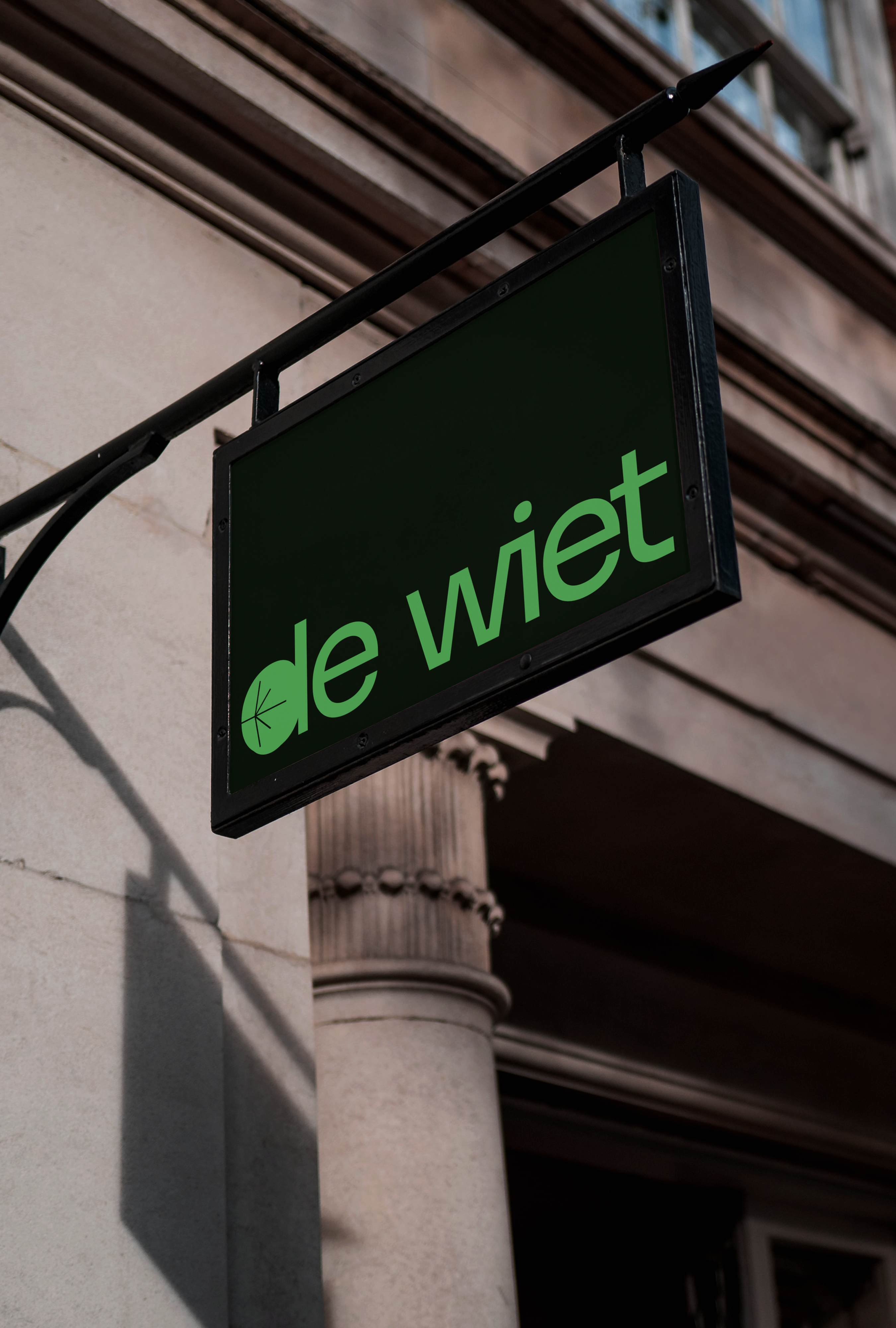
De wiet ( 2022 )
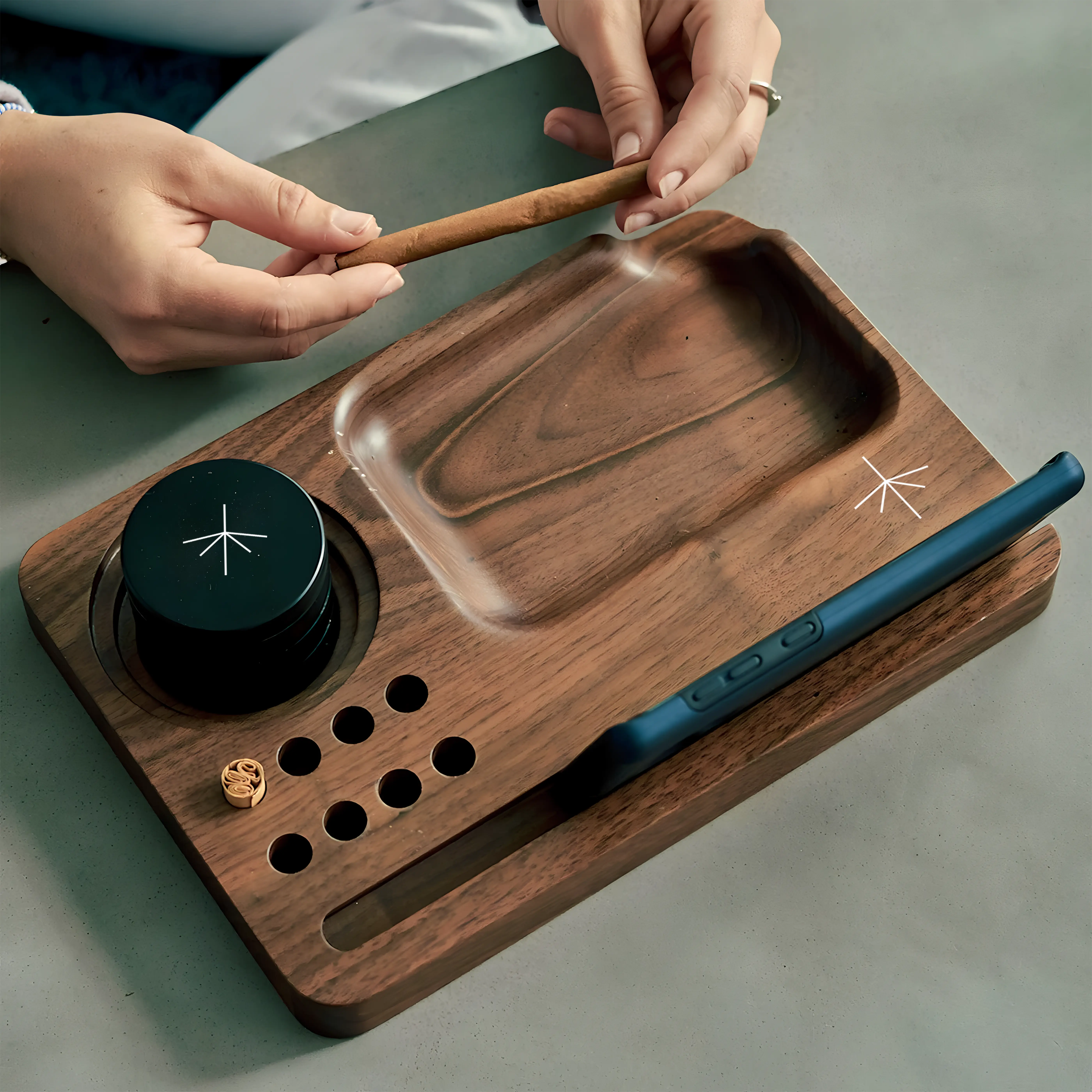
An experimental branding and identity creation for an Amsterdam-based cannabis café, De Wiet redefines the usual trippy, energetic identity with bold simplicity and a quirky system. This design captures Amsterdam's essence while conveying the brand's premium, trustworthy, and high-quality characteristics.
Project Type
Branding
Visual Identity
Curated by
Vivekanandan R
Duration
2 Weeks

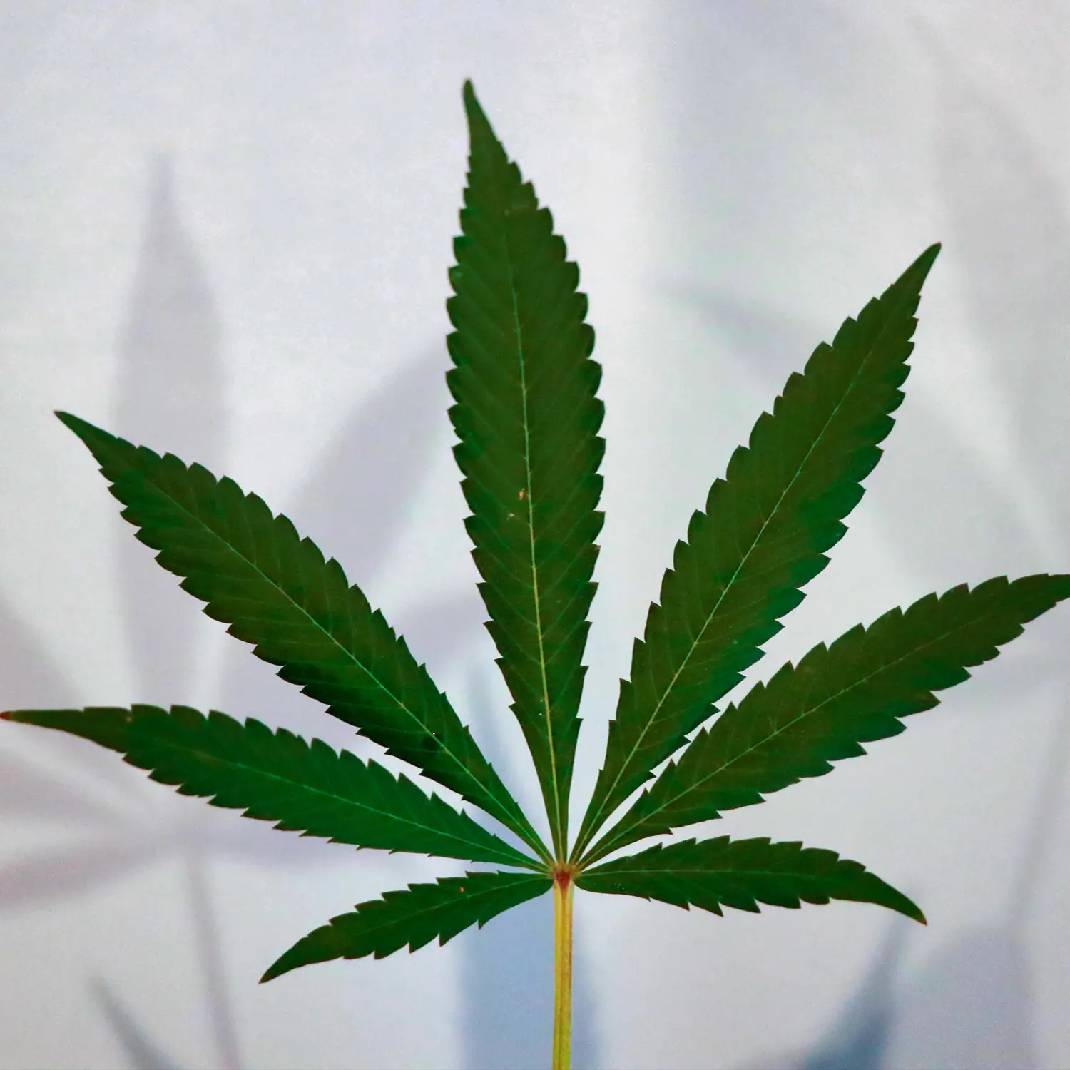
Amsterdam & Cannabis
Amsterdam is known as a "weed paradise" due to its lenient policies on cannabis use and possession. While technically illegal, the Netherlands allows small-scale cannabis use and possession for personal purposes, creating a distinctive and open-minded environment.
Amsterdam and Cannabis
This branding captures a balance of playful calmness and community spirit. Moving away from the typical intense visuals of cannabis culture, this identity highlights De Wiet’s values of simplicity, quirkiness, and memorable engagement through consistent mnemonic elements, presenting a distinctive and approachable brand.
mnemonic
Horizontal Stack

Vertical Stack
Color
This Palette harmonizes calm sophistication with mint cream and product identity with pigment green. A darker premium green introduces contrast, creating a visually captivating experience with an energetic yet serene ambiance.
Night
# 060E06
Pigment Green

# 489B4B
Mint Cream
# F7FFF9
aa
Heading - Sora ( ITF )
Contrasted typography
Body - Clash Display ( ITF )
The minimalistic and highly legible Sora typeface is contrasted with the dynamic and energetic aesthetic of Clash Display.
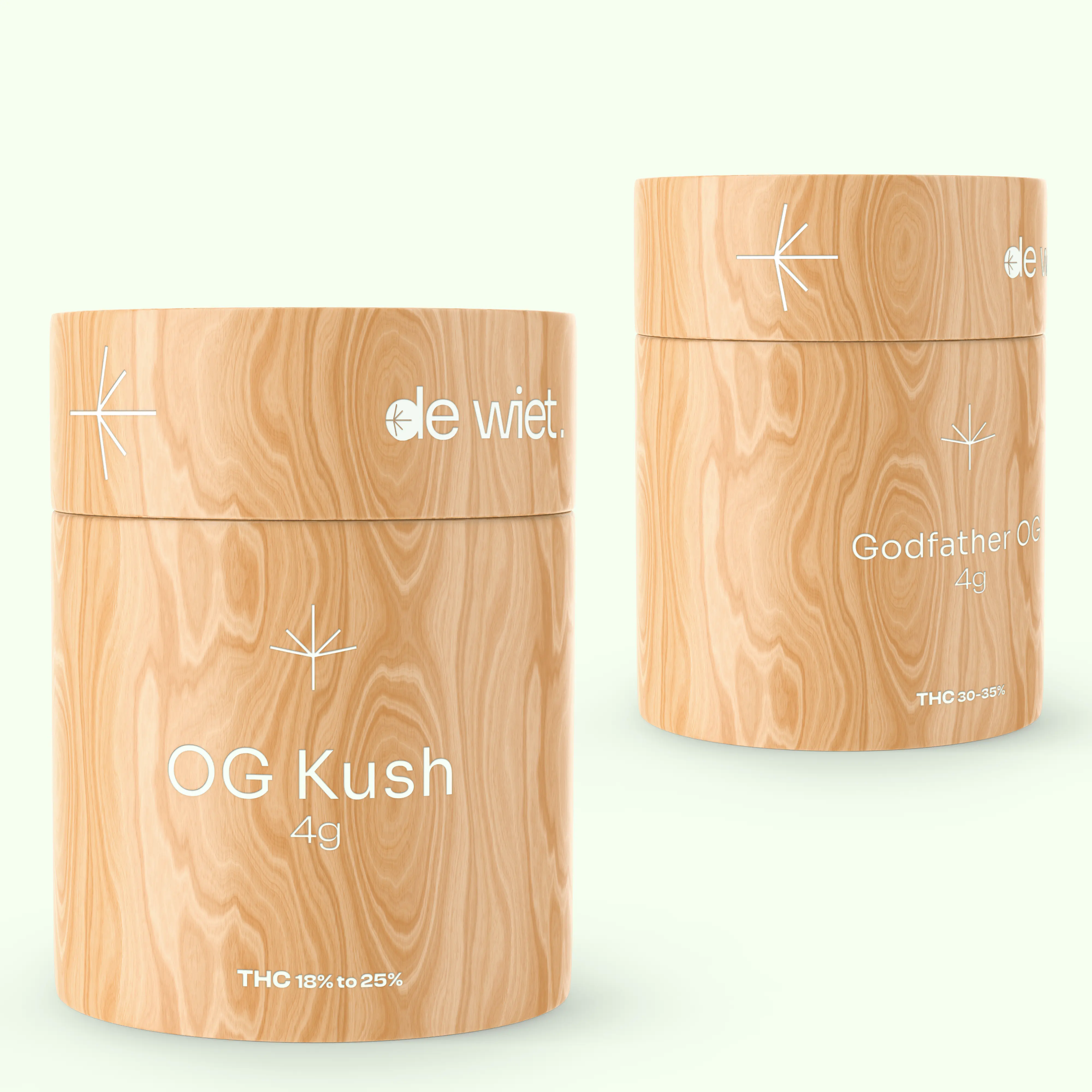
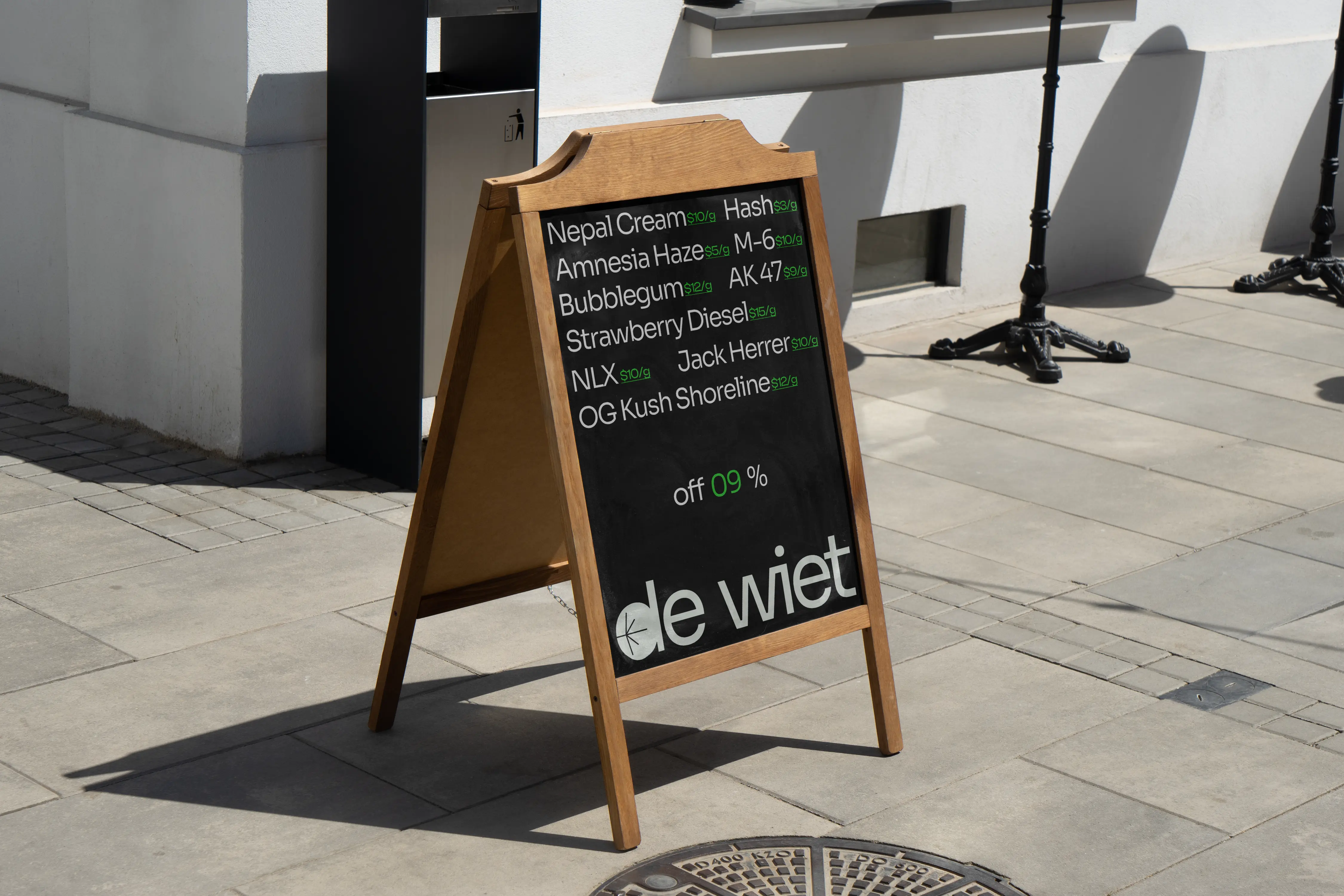
Semiotics & Symbol
Brand symbol, meticulously crafted, integrates elements of Amsterdam like canals, tulips, and cannabis. This symbol harmoniously blends these aspects to evoke the essence of Amsterdam and communicates mystery and curiosity.


Pattern
The captivating pattern is created by multiplying the brand symbol, emphasizing unique characters and negative spaces. This pattern evokes Amsterdam's quirkiness, delivering an intriguing and harmonious experience to the viewers.